
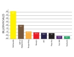
The design that I decided to alter is a graph that represents the annual sales of 8 different fast food restaurants, and how they compare to not only each other, but also the GDP of the country of Afghanistan.
In the old chart, the first the I noticed that was unappealing to me was the way the information went from right to left across the graph. I think that being so used to reading things from left to right, a graph should also follow that standard.
The next thing I noticed was the logos for all of the different chain restaurants. I realized that as the smaller each logo got, the harder it was to realize which company it represented because there was nothing else written about it that told a viewer what the logo was for. In order to fix this problem, I decided to make a simple bar graph that instead of using a company logo, used a color that could be associated with each company in order to display a difference between each figure. I think that this method combined with the titles placed under each bar make it easier for a viewer to get the information they need out of the graph.
The next problem I had with the old graph was the way in which the figures and information was displayed for each company. They wrote the figure off in space somewhere and had an extremely thin line connecting the number to the company logo. More than one time I found myself trying to figure out with number went to which logo. In order to change this, I took the bars that I had made for each company and simply wrote inside of the what the figure was. I think that the combination of the bar, title beneath it, and figure inside of it make it extremely easy for the viewer to figure out what they are looking at and decrease the possibility of any confusion.
In order to handle the viewers memory, I thought this approach would be easiest because of the association between the company and the color used to represent it. I think that the dominant color for each company is obvious enough to be able to remember where it landed on the chart given its financial figures. I think that the biggest enemy for the creator of a chart like this is short term memory loss. If you were to put this chart in front of someone with just the figures, and bars with no color, I do not think the information given could be retained by most audiences for more than a couple minutes. However, with the addition of color and the left to right viewing, a viewer may get a snapshot in their mind of the way the colors change or where certain ones fell on the graph.
Original Graph Cite:

